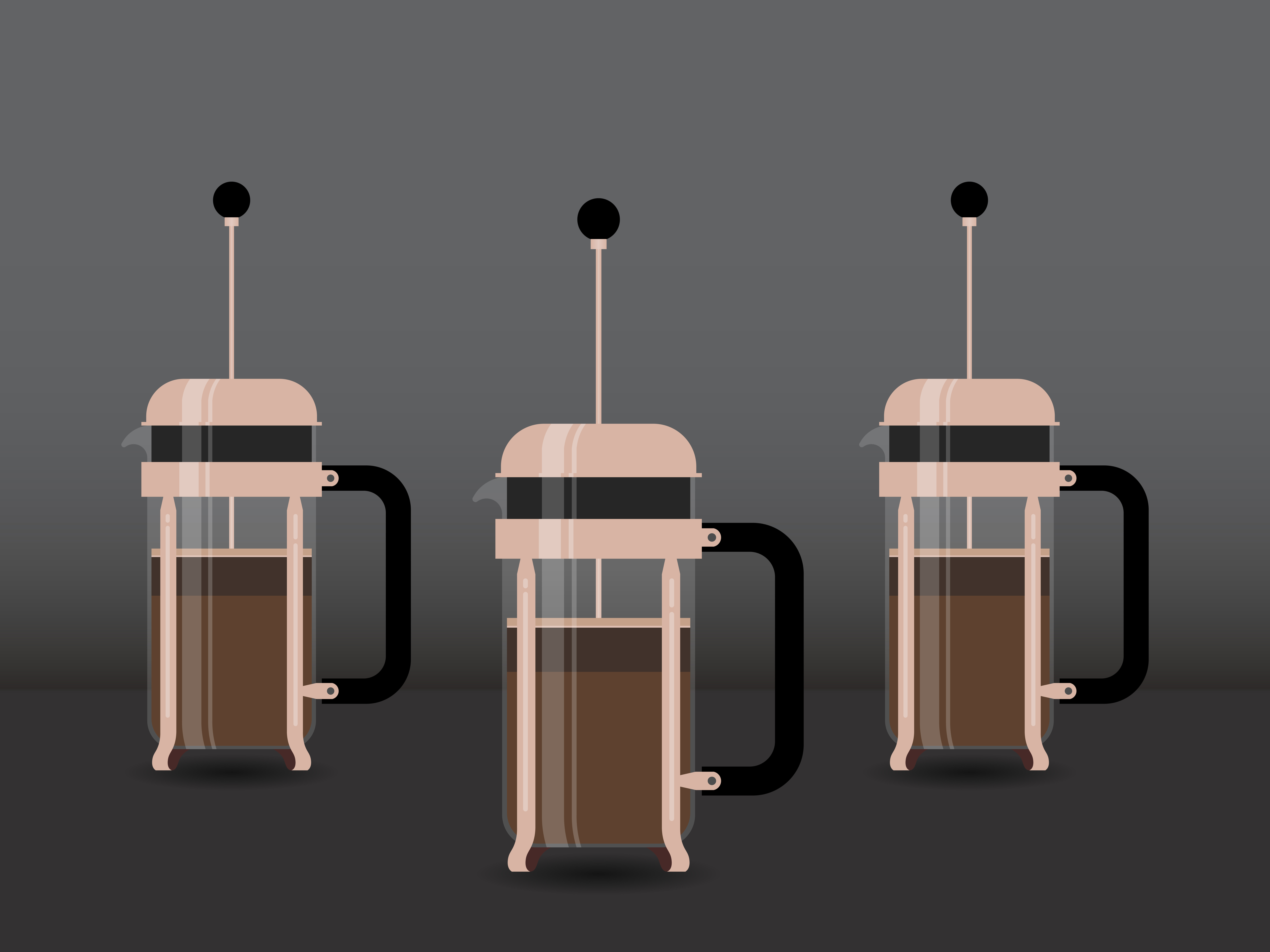
At the end of 2017, I was put in charge of refreshing the brand image at Pulse Marketing. We were beginning to go after larger scale clients so the goal here was to ditch our black and red look for a more upscale black and copper. We really wanted to appear like a large, upscale agency without losing the appearance of our creative and young team. I managed to keep this balance by using a darker theme overall but used trendy photography styles as moody accents and backgrounds. We also went with a handwritten display typeface for graphic headers paired with an elegant, minimalist typeface for body type to show a balance of upscale business and youthful creative energy.


